codec
Documentation and HELP
Last Updated: 07 November 2015
Current Version: 1.0
Thank you for purchasing our item. If you have any questions that are beyond the scope of this help file, please feel free to email via our profile page
Contact Us1 Introduction
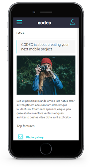
Codec is an HTML mobile template created for a mobile website, web app, and integrated with solutions like phonegap, for a real native app. It is build using an original design concept, some amazing animations for elements and a perfect responsive code.
1.A Package files content. - top ^
The package you downloaded from themeforest include the following structure:

The main HTML files of the template are found inside the "codec" folder. The HELP folder includes the documentation.
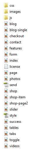
Inside the "codec" folder you will see the following structure:
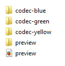
There are 3 main colors of the template available. All 3 are in "codec-blue", "codec-green" and "codec-yellow" folders.
The "preview.html" file and "preview" folder are only used for preview. When using the template on your server you can delete those 2, and upload just the files from 1 of the 3 color folders.
When you will open a color folder, like "codec-blue" the files will be like in the following structure.
The main file of your template and the one you will use as your main mobile home page is index.html
1.B HTML/CSS templates, definition and usage. - top ^
A HTML/CSS Template is a pre-designed layout that will help you build a final website. HTML ( HyperText Markup Language) is the basic coding to create web pages. CSS stands for Cascading Style Sheets and it's used to define and style the HTML elements.
To install a HTML/CSS template requires just to copy the template files on your webserver. This can be done using your hosting provider custom interface or a FTP (File Transfer Protocol) software. Our recommandation is FileZilla.
A regular HTML/CSS template does NOT include a CMS (Content Management System) to edit/add content of the pages. All content is edited using a HTML editor. HTML editors can be found as free and paid editors. Some modern HTML editors have included a DESIGN view mode of the code, making it easier for templates to be edited. Regular ones will let you edit the content only from the code mode, meaning you will need to have a basic HTML coding knowledge.
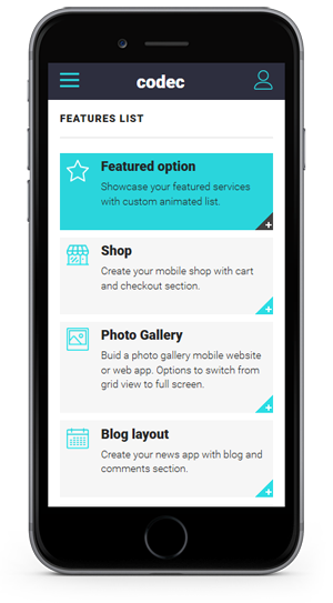
2 Different usage of this mobile template - top ^
This mobile template can be used to create a mobile website, a web app, and a native app. Depending on your needs you can use this layout to create the desired final product. Below we will try to describe each one of the final product you can create.
2.ACreating a mobile website, redirecting from your desktop website to the mobile one. - top ^
You can use this template to create a mobile version of your website. Considering that you main desktop website is not responsive or you want to have a separate mobile version of it, this template is a perfect solution to do that.
To createa a separate mobile version of your website using this template will require to create a subdomain or a subfolder of your domain (mobile.yourwebsite.com or m.yourwebsite.com) where the main files will be copied.
To redirect users to your new created mobile website you will need to use a redirection code. First you need to add a mobile detection code, and then redirect mobile users to the mobile url.
For more information about mobile detection and redirection check THIS WEBSITE.
2.BCreating a web app, difference between web app and native app. - top ^
You can use this template to create a web app. Web apps are simple web applications than run from a web server. Web apps are visible through a web browser and function just like a normal website.
This template offers the feel of a web app because of his Ajax and jQuery effects and navigation.
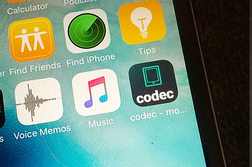
The difference between web and native apps is that native apps are developed essentially for one particular mobile device and is installed directly onto the device itself. And are available only on app stores. Web apps can be used on any mobile device, and do not need to be downloaded first, they will run normally like any website.
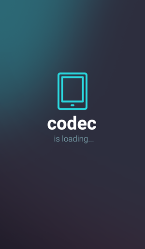
Below you can see how your web app icon will look saved on iPhone home screen. Saving it like this will give an option to open it directly in full screen mode.
To modify the icon and loading screen images see the code in the header section of index.html file
<meta name="apple-mobile-web-app-capable" content="yes">
<meta name="apple-mobile-web-app-status-bar-style" content="black">
<link rel="apple-touch-icon" href="images/apple-touch-icon.png" />
<link rel="apple-touch-startup-image" media="(device-width: 320px) and (device-height: 568px) and (-webkit-device-pixel-ratio: 2)" href="images/apple-touch-startup-image-640x1096.png">
Images are located inside images folder.
2.CConverting it into a native app. - top ^
To convert this template into a native app you will need to use solutions like phonegap.
"Easily create apps using the web technologies you know and love: HTML, CSS, and JavaScript .
PhoneGap is a free and open source framework that allows you to create mobile apps using standardized web APIs for the platforms you care about. "
More about phonegap on their WEBSITE
3 Editing this template - top ^
EDITING THIS TEMPLATE REQUIRES BASIC HTML/CSS AND JAVASCRIPT KNOWLEDGE. IF YOU DON'T HAVE A BASIC KNOWLEDGE OF THIS WE RECOMMEND HIRE A WEBDESIGNER OR LOOK FOR A FREELANCER ON ENVATO STUDIO.
EDITING THIS MOBILE TEMPLATE DO NOT REQUIRE A SERVER. YOU CAN EDIT IT USING A LOCAL HTML EDITOR SOFTWARE. ONLY TESTING IT, WILL REQUIRE TO BE UPLOADED TO A SERVER. THE BEST WAY TO TEST THE TEMPLATE IS WITH YOUR MOBILE.
To edit this HTML template you will need a HTML editor. Even Notepad will do the job, but a dedicated HTML editor will work better in arranging the code structure. HTML editors are softwares that allow code editing. Some HTML editors have included a DESIGN mode, which will allow you to see the interface of the page you are editing. Editors can be found FREE or PREMIUM on the WEB.
TESTING THIS TEMPLATE MAY REQUIRE TO UPLOAD THE FILES TO A WEB SERVER. THE NEW FEATURES OF THIS TEMPLATE ARE MADE ONLY FOR THE LATEST MOBILE PHONES
3.A Home page structure - top ^
The main page of this template is index.html file. This is the home page of your website, the first page the browser will open when users will access your website.
Home page HTML structure starts with LEFT and RIGHT panels.
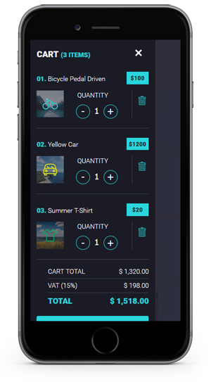
The LEFT panel contains the shopping cart layout. Using this structure you can create your own real shop.
The HTML structure of the cart contains:
    <div class="panel panel-left panel-reveal">
         <div class="cartcontainer">
            <h2>CART <span>(3 ITEMS)</span></h2>
            <a href="#" class="closecart close-panel"><img src="images/icons/white/menu_close.png" alt="" title="" /></a>

            <div class="cart_item" id="cartitem1">
                <div class="item_title"><span>01.</span> Bicycle Pedal Driven</div>
                <div class="item_price">$100</div>
            	<div class="item_thumb"><a href="shop-item.html" class="close-panel"><img src="images/shop_thumb1.jpg" alt="" title="" /></a></div>
                <div class="item_qnty">
                    <form id="myform" method="POST" action="#">
                        <label>QUANTITY</label>
                        <input type="button" value="-" class="qntyminus" field="quantity" />
                        <input type="text" name="quantity" value="1" class="qnty" />
                        <input type="button" value="+" class="qntyplus" field="quantity" />
                    </form>
                </div>
                <a href="#" class="item_delete" id="cartitem1"><img src="images/icons/yellow/trash.png" alt="" title="" /></a>           </div>
  ................................

              <div class="carttotal">
                  <div class="carttotal_row">
                  <div class="carttotal_left">CART TOTAL</div>  <div class="carttotal_right">$ 1,320.00</div>
                  </div>
                  <div class="carttotal_row">
                  <div class="carttotal_left">VAT (15%)</div>  <div class="carttotal_right">$ 198.00</div>
                  </div>
                  <div class="carttotal_row_last">
                  <div class="carttotal_left">TOTAL</div> <div class="carttotal_right">$ 1,518.00</div>
                  </div>
              </div>

              <a href="checkout.html" class="checkout close-panel">PROCEED TO CHECKOUT</a>           </div>
    </div>
The RIGHT panel is the user account page. Here you can create your users profiles, and user menu.
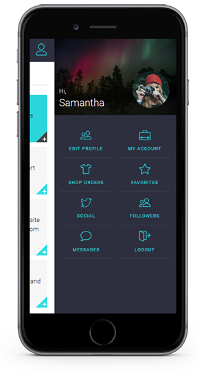
The HTML structure of the RIGHT panel is:
<div class="panel panel-right panel-reveal">
<div class="user_login_info">
<div class="user_thumb">
<img src="images/profile.jpg" alt="" title="" />
<div class="user_details">
<p>Hi, <span>Samantha</span></p>
</div>
<div class="user_avatar"><img src="images/avatar.jpg" alt="" title="" /></div>
</div><nav class="user-nav">
<ul>
<li><a href="features.html" class="close-panel"><img src="images/icons/yellow/users.png" alt="" title="" /><span>EDIT PROFILE</span></a></li>
<li><a href="features.html" class="close-panel"><img src="images/icons/yellow/briefcase.png" alt="" title="" /><span>MY ACCOUNT</span></a></li>
<li><a href="features.html" class="close-panel"><img src="images/icons/yellow/orders.png" alt="" title="" /><span>SHOP ORDERS</span></a></li>
<li><a href="features.html" class="close-panel"><img src="images/icons/yellow/favorites.png" alt="" title="" /><span>FAVORITES</span></a></li>
<li><a href="features.html" class="close-panel"><img src="images/icons/yellow/twitter.png" alt="" title="" /><span>SOCIAL</span></a></li>
<li><a href="features.html" class="close-panel"><img src="images/icons/yellow/users.png" alt="" title="" /><span>FOLLOWERS</span></a></li>
<li><a href="features.html" class="close-panel"><img src="images/icons/yellow/message.png" alt="" title="" /><span>MESSAGES</span></a></li>
<li><a href="index.html" class="close-panel"><img src="images/icons/yellow/logout.png" alt="" title="" /><span>LOGOUT</span></a></li>
</ul>
</nav>
</div>
</div>
To open one of this panels you need to setup your link or button like:
<a href="#" data-panel="left" class="open-panel"></a>
<a href="#" data-panel="right" class="open-panel"></a>
The home page HTML structure continues with the main menu and header title.
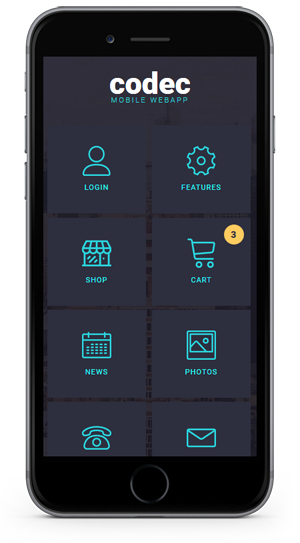
The structure of the menu is:
          <div data-page="index" class="page homepage">
            <div class="page-content">
					<div class="logo"><h1>codec</h1><span>MOBILE WEBAPP</span></div>
                       <nav class="main-nav">
                        <ul>
                          <li><a href="#" data-popup=".popup-login" class="open-popup"><img src="images/icons/yellow/user.png" alt="" title="" /><span>LOGIN</span></a></li>
                          <li><a href="features.html"><img src="images/icons/yellow/settings.png" alt="" title="" /><span>FEATURES</span></a></li>
                          <li><a href="shop.html"><img src="images/icons/yellow/shop.png" alt="" title="" /><span>SHOP</span></a></li>
                          <li><a href="#" data-panel="left" class="open-panel"><img src="images/icons/yellow/cart.png" alt="" title="" /><span>CART</span><div class="cartitems">3</div></a></li>
                          <li><a href="blog.html"><img src="images/icons/yellow/blog.png" alt="" title="" /><span>NEWS</span></a></li>
                          <li><a href="photos.html"><img src="images/icons/yellow/photos.png" alt="" title="" /><span>PHOTOS</span></a></li>
                          <li><a href="tel:1234 5678" class="external"><img src="images/icons/yellow/phone.png" alt="" title="" /><span>CALL US</span></a></li>
                          <li><a href="contact.html"><img src="images/icons/yellow/contact.png" alt="" title="" /><span>MESSAGE</span></a></li>
                        </ul>
                      </nav>
            </div>
          </div>
To add a new menu link just copy a LI structure, and add your icon, title and url.
<li><a href="features.html"><img src="images/icons/yellow/settings.png" alt="" title="" /><span>FEATURES</span></a></li>
In the home page code there is also included some popups. User login/register/forgot password popups, and social icons/shop categories popups.
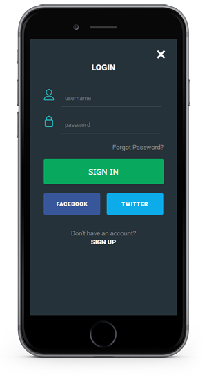
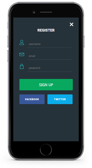
The HTML code for one popup looks like:
<!-- Login Popup -->
<div class="popup popup-login">
<div class="content-block-login">
<h4>LOGIN</h4>
<div class="loginform">
<form id="LoginForm" method="post">
<div class="form_row">
<div class="form_row_icon"><img src="images/icons/yellow/user.png" alt="" title="" /></div>
<input type="text" name="Username" value="" class="form_input required" placeholder="username" />
</div>
<div class="form_row">
<div class="form_row_icon"><img src="images/icons/yellow/lock.png" alt="" title="" /></div>
<input type="password" name="Password" value="" class="form_input required" placeholder="password" />
</div>
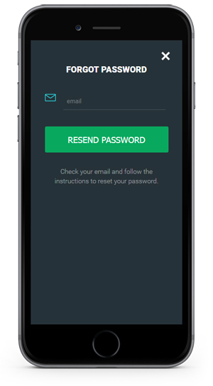
<div class="forgot_pass"><a href="#" data-popup=".popup-forgot" class="open-popup">Forgot Password?</a></div>
<input type="submit" name="submit" class="form_submit" id="submit" value="SIGN IN" />
</form>
<div class="signup_social">
<a href="http://www.facebook.com/" class="signup_facebook external">FACEBOOK</a>
<a href="http://www.twitter.com/" class="signup_twitter external">TWITTER</a> </div>
<div class="signup_bottom">
<p>Don't have an account?</p>
<a href="#" data-popup=".popup-signup" class="open-popup">SIGN UP</a> </div>
</div>
<div class="close_loginpopup_button"><a href="#" class="close-popup"><img src="images/icons/white/menu_close.png" alt="" title="" /></a></div>
</div>
</div>
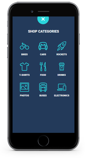
The popups used are the social popup and the shop categories one.
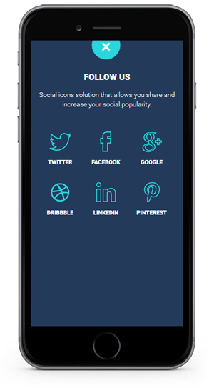
The code for social popup for example is structured like :
 <!-- Social Popup -->

<div class="popup popup-social">

<div class="content-block">

<h4>FOLLOW US</h4>

<p>Social icons solution that allows you share and increase your social popularity.</p>

<ul class="popup_categories">

<li><a href="http://twitter.com/" class="external"><img src="images/icons/blue/twitter.png" alt="" title="" /><span>TWITTER</span></a></li>

<li><a href="http://www.facebook.com/" class="external"><img src="images/icons/blue/facebook.png" alt="" title="" /><span>FACEBOOK</span></a></li>

<li><a href="http://plus.google.com" class="external"><img src="images/icons/blue/gplus.png" alt="" title="" /><span>GOOGLE</span></a></li>

<li><a href="http://www.dribbble.com/" class="external"><img src="images/icons/blue/dribbble.png" alt="" title="" /><span>DRIBBBLE</span></a></li>

<li><a href="http://www.linkedin.com/" class="external"><img src="images/icons/blue/linkedin.png" alt="" title="" /><span>LINKEDIN</span></a></li>

<li><a href="http://www.pinterest.com/" class="external"><img src="images/icons/blue/pinterest.png" alt="" title="" /><span>PINTEREST</span></a></li>

</ul>

<div class="close_popup_button"><a href="#" class="close-popup"><img src="images/icons/white/menu_close.png" alt="" title="" /></a></div>

</div>

</div>
3.B Secondary pages - top ^
The structure of the secondary pages is different from the home page. In the secondary pages the layout starts with div class="pages". The rest of the header HTML elements are missing. Styles, javascript code is only added on home page.
First element on a secondary page is the header. All pages have the same header.
You can modify your header, and add the icons and links you want.
     <div class="navbarpages">
       <div class="navbar_left"><a href="index.html"><img src="images/icons/blue/menu.png" alt="" title="" /></a></div>
       <div class="navbar_center"><h2><a href="index.html">codec</a></h2></div>
       <div class="navbar_right"><a href="#" data-panel="right" class="open-panel"><img src="images/icons/blue/user.png" alt="" title="" /></a></div>
     </div>
All the content of one secondary page is added inside the DIV "pages_maincontent"
<div id="pages_maincontent">
</div>
IMPORTANT: All the styles and custom javascript/jquery function you want to use on secondary pages must be added on home page, or in my-app.js file (for the custom js functions)
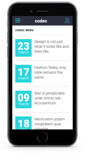
2.C Blog section - top ^
The Blog section is a static news page. All posts in this section must be manually added. To create this news section dinamically will require some programming code and a database. There is also a details page included blog-single.html which is the single blog page of one post.
The HTML code of a blog post:
                <li>
                    <div class="post_entry">
                        <div class="post_date">
                            <span class="day">23</span>
                            <span class="month">march</span>
                        </div>
                        <div class="post_title">
                        <h2><a href="blog-single.html">Design is not just what it looks like and feels like.</a></h2>
                        </div>
                    </div>
                </li>
At the bottom of all posts list is a button which clicked will load more posts.
            <div id="loadMore"><img src="images/load_posts.png" alt="" title="" /></div>
            <div id="showLess"><img src="images/load_posts_disabled.png" alt="" title="" /></div>
To edit the number os posts to show see the javascript file inside the "js" folder, called my-app.js. And the code to edit is x=4; from this function:
		$(".posts li").hide();
		size_li = $(".posts li").size();
		x=4;
		$('.posts li:lt('+x+')').show();
		$('#loadMore').click(function () {
			x= (x+1 <= size_li) ? x+1 : size_li;
			$('.posts li:lt('+x+')').show();
			if(x == size_li){
				$('#loadMore').hide();
				$('#showLess').show();
			}
		});
3.D Photo Gallery - top ^
Using this template you can create a photo gallery web app.
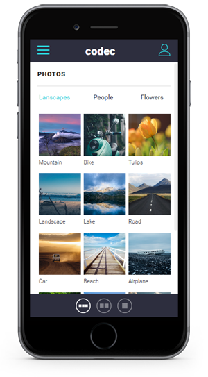
The gallery page starts with the switching icons. Using this icons you can switch the gallery view mode. From 1/3 photos on a row to 1/2 and full width.
       <div class="gallery_switch">
        <a href="#" id="view13" class="switcher active"><img src="images//switch_13_active.png" alt="Grid"></a>
        <a href="#" id="view12" class="switcher"><img src="images/switch_12.png" alt="Grid"></a>
        <a href="#" id="view11" class="switcher"><img src="images/switch_11.png" alt="List"></a>
      </div>
The photos pages code continues with the filters categories
              <div class="photo-categories">
                    <a href="#tab1p" class="tab-link active category-link">Lanscapes</a>
                    <a href="#tab2p" class="tab-link category-link">People</a>
                    <a href="#tab3p" class="tab-link category-link">Flowers</a>
              </div>
And each filter/category will select the current photos from a tab system.
                             <ul id="photoslist" class="photo_gallery_13">
                                <li><a rel="gallery-3" href="images/photos/photo1.jpg" title="Photo title" class="swipebox"><img src="images/photos/photo1.jpg" alt="image"/><span>Mountain</span></a></li>
                                <li><a rel="gallery-3" href="images/photos/photo2.jpg" title="Photo title" class="swipebox"><img src="images/photos/photo2.jpg" alt="image"/><span>Bike</span></a></li>
                                <li><a rel="gallery-3" href="images/photos/photo3.jpg" title="Photo title" class="swipebox"><img src="images/photos/photo3.jpg" alt="image"/><span>Tulips</span></a></li>
                                <li><a rel="gallery-3" href="images/photos/photo4.jpg" title="Photo title" class="swipebox"><img src="images/photos/photo4.jpg" alt="image"/><span>Landscape</span></a></li>
                                <li><a rel="gallery-3" href="images/photos/photo5.jpg" title="Photo title" class="swipebox"><img src="images/photos/photo5.jpg" alt="image"/><span>Lake</span></a></li>
                                <li><a rel="gallery-3" href="images/photos/photo6.jpg" title="Photo title" class="swipebox"><img src="images/photos/photo6.jpg" alt="image"/><span>Road</span></a></li>
                                <li><a rel="gallery-3" href="images/photos/photo7.jpg" title="Photo title" class="swipebox"><img src="images/photos/photo7.jpg" alt="image"/><span>Car</span></a></li>
                                <li><a rel="gallery-3" href="images/photos/photo8.jpg" title="Photo title" class="swipebox"><img src="images/photos/photo8.jpg" alt="image"/><span>Beach</span></a></li>
                                <li><a rel="gallery-3" href="images/photos/photo9.jpg" title="Photo title" class="swipebox"><img src="images/photos/photo9.jpg" alt="image"/><span>Airplane</span></a></li>
                                <li><a rel="gallery-3" href="images/photos/photo10.jpg" title="Photo title" class="swipebox"><img src="images/photos/photo10.jpg" alt="image"/><span>Railroad</span></a></li>
                                <li><a rel="gallery-3" href="images/photos/photo11.jpg" title="Photo title" class="swipebox"><img src="images/photos/photo11.jpg" alt="image"/><span>Aerial View</span></a></li>
                                <li><a rel="gallery-3" href="images/photos/photo12.jpg" title="Photo title" class="swipebox"><img src="images/photos/photo12.jpg" alt="image"/><span>Mountains</span></a></li>
                                <li><a rel="gallery-3" href="images/photos/photo13.jpg" title="Photo title" class="swipebox"><img src="images/photos/photo13.jpg" alt="image"/><span>Palm Tree</span></a></li>
                                <li><a rel="gallery-3" href="images/photos/photo14.jpg" title="Photo title" class="swipebox"><img src="images/photos/photo14.jpg" alt="image"/><span>Eagle</span></a></li>
                                <li><a rel="gallery-3" href="images/photos/photo15.jpg" title="Photo title" class="swipebox"><img src="images/photos/photo15.jpg" alt="image"/><span>Birds</span></a></li>
                               <div class="clearleft"></div>
                              </ul>
To add a new photo just add a new line of
<li><a rel="gallery-3" href="images/photos/photo9.jpg" title="Photo title" class="swipebox"><img src="images/photos/photo9.jpg" alt="image"/></a></li>
3.E Shop page - top ^
This template contains SHOP design pages. All pages are HTML coded, with no database and real shop functionality. In order to do that you will need to integrate the HTML code into a e-commerce CMS.
The shop page contains a list of items. Each item have a title, a quantity select input, a price and an ADD TO CART button.
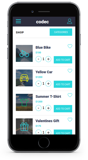
The code of one item is:
 <li>

<div class="shop_thumb"><a href="shop-item.html"><img src="images/shop_thumb1.jpg" alt="" title="" /></a></div>

<div class="shop_item_details">

<h4><a href="shop-item.html">Blue Bike</a></h4>

<div class="shop_item_price">$100</div>

<div class="item_qnty_shop">

<form id="myform" method="POST" action="#">

<input type="button" value="-" class="qntyminusshop" field="quantity" />

<input type="text" name="quantity" value="1" class="qntyshop" />

<input type="button" value="+" class="qntyplusshop" field="quantity" />

</form>

</div>

<a href="#" data-panel="left" id="addtocart" class="open-panel">ADD TO CART</a>

<a href="#" data-popup=".popup-social" class="open-popup shopfav"><img src="images/icons/blue/love.png" alt="" title="" /></a>

</div>

</li>
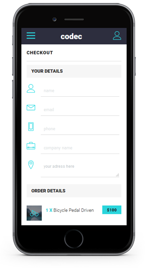
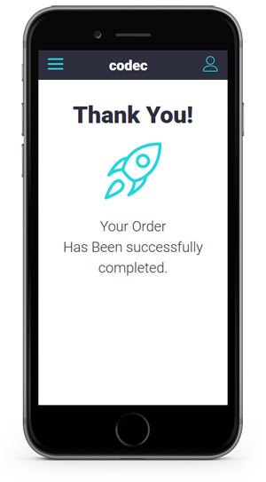
Other shop related page included are CHECKOUT page and THANK YOU page.
The checkout page contains a form that you can use in colecting your users info about the purchase.
3.F Contact page - top ^
The template includes a functional contact form.
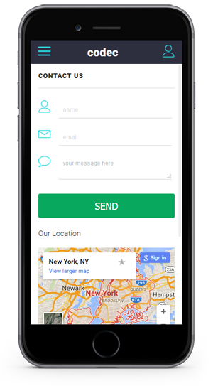
The HTML code of the form is:
            <div class="contactform">
            <form class="cmxform" id="ContactForm" method="post" action="">
            <div class="form_row">
            <div class="form_row_icon"><img src="images/icons/blue/user.png" alt="" title="" /></div>
            <input type="text" name="ContactName" id="ContactName" value="" class="form_input required" placeholder="name"/>
            </div>
            <div class="form_row">
            <div class="form_row_icon"><img src="images/icons/blue/contact.png" alt="" title="" /></div>
            <input type="text" name="ContactEmail" id="ContactEmail" value="" class="form_input required email" placeholder="email"/>
            </div>
            <div class="form_row">
            <div class="form_row_icon"><img src="images/icons/blue/message.png" alt="" title="" /></div>
            <textarea name="ContactComment" id="ContactComment" class="form_textarea textarea required" rows="" cols="">your message here</textarea>
            </div>
            <input type="submit" name="submit" class="form_submit" id="submit" value="SEND" />
            <input class="" type="hidden" name="to"  value="youremail@yourwebsite.com" />
            <input class="" type="hidden" name="subject" value="Contacf form message" />
            <label id="loader" style="display:none;"><img src="images/loader.gif" alt="Loading..." id="LoadingGraphic" /></label>
            </form>
            </div>
To edit the email you want to receive the messages just edit the line:
<input class="" type="hidden" name="to" value="youremail@yourwebsite.com" />
4 CSS Files - top ^
The template is using for each design 2 main CSS file and 3 secondary ones.
1. The general css file is style.css loaded in each index file
<link type="text/css" rel="stylesheet" href="css/style.css"/>
At the top of the style.css file there is a "Table of Contents" list that will guide through the CSS code.
1. RESET
2. GENERAL
3. CUSTOM BUTTONS
4. RIGHT SLIDE PANEL - USER ACCOUNT PAGE
    4-1. USER ACCOUNT PAGE
5. MAIN NAVIGATION ON HOME PAGE
	5-1. MAIN NAVIGATION
	5-2. HOME PAGE LOGO
6. PAGES LAYOUT
    6-1. PAGES HEADER
	6-2. PAGES WITH TABLES
7. FEATURED LISTS
8. POPUPS
9. SHOP
    9-1. SHOP ITEM PAGE
	9-2. SHOPPING CART - CECKOUT - LEFT SLIDE PANEL
	9-3. SUCCESS PAGE
10. PHOTO GALLERY
11. BLOG LAYOUT
    11-1. BLOG COMMENTS
12. FORMS
	12-1. CONTACT FORM
	12-2. LOGIN / SIGNUP / FORGOT PASS FORM
	12-3. COMMENT FORM
13. TABS & ACCORDION
14. MEDIA QUERIES
    - @media screen and (max-width: 480px)
The template uses a custom google web font.
In style.css the font is defined in the body section
body {
  font-family: 'Roboto', sans-serif;
   }
And loaded in the header section of the main index.html file
<link href='http://fonts.googleapis.com/css?family=Roboto:400,300,900' rel='stylesheet' type='text/css'>
The second main CSS file is the color style. In each index HTML file there si a specifi color style added. Just like the main index.html file have:
<link rel="stylesheet" href="css/blue.css">
2. The secondary CSS files found inside the CSS folder.
framework7.css file is the script CSS we are using to create the main functionality of the pages. WE RECOMMEND NOT TO EDIT THIS.
reset.css is a general reseting code for browsing.
swipebox.css is the CSS of the photo gallery section.
5 JavaScript Files - top ^
The template includes 7 javascript files which are loaded at the end of index file
<script type="text/javascript" src="js/jquery-1.10.1.min.js"></script>
<script type="text/javascript" src="js/jquery-ui.min.js"></script>
<script src="js/jquery.validate.min.js" type="text/javascript"></script>
<script type="text/javascript" src="js/framework7.js"></script>
<script type="text/javascript" src="js/my-app.js"></script>
<script type="text/javascript" src="js/jquery.swipebox.js"></script>
<script type="text/javascript" src="js/email.js"></script>
1. <script type="text/javascript" src="js/jquery-1.10.1.min.js"></script>
jQuery general code. Version 1.10.1
2. <script type="text/javascript" src="js/jquery-ui.min.js"></script>
The jquery user interface code.
3.<script src="js/jquery.validate.min.js" type="text/javascript"></script>
The code that validates the forms
4.<script type="text/javascript" src="js/framework7.min.js"></script>
Framework7 is the main js core file of the template.
5.<script type="text/javascript" src="js/my-app.js"></script>
The custom functions of the template.
All pages custom functions are added here. For example tabs, toogles and the rest of the custom code needed on a secondary page.
IMPORTANT:
All custom javascript functions used for secondary pages must be added in this file, my-app.js inside a myApp.onPageInit( .... function
For example see the functions loaded just for blog page
myApp.onPageInit('blog', function (page) {


$(".posts li").hide();

size_li = $(".posts li").size();

x=4;

$('.posts li:lt('+x+')').show();

$('#loadMore').click(function () {

x= (x+1 <= size_li) ? x+1 : size_li;

$('.posts li:lt('+x+')').show();

if(x == size_li){

$('#loadMore').hide();

$('#showLess').show();

}

});


$("ul.posts > li div.post_date")

.css('opacity', '0')

.each(function(index, item) {

setTimeout(function() {

$(item).animate({'left':'0px', 'opacity':1},800,"easeInOutCirc");

}, index*175);

});

$("ul.posts > li div.post_title")

.css('opacity', '0')

.each(function(index, item) {

setTimeout(function() {

$(item).animate({'right':'0px', 'opacity':1},800,"easeInOutCirc");

}, index*175);

});

})
6. <script type="text/javascript" src="js/jquery.swipebox.js"></script>
Photo Gallery custom function.
7. <script type="text/javascript" src="js/email.js"></script>
Validation and sending functions for the contact form
6 Sources and Credits - top ^
- jQuery - from http://jquery.com/
- Framework7 - http://www.idangero.us/framework7/
- Swipebox - http://brutaldesign.github.io/swipebox/
- Free icons - https://linearicons.com/free
- Demo photos - unsplash.com